INTRODUCING LET'S GARDEN
Let's Garden is a digital gardening application designed to support and connect new and experienced gardeners.
The app was created in response to a design assignment, in which my partners and I were to build a final deliverable specifically for gardeners.
Let's Garden was developed based on user research, competitive analysis, persona creations, analysis of user flow, and usability testing.
Product Strategy: Yoon Kim, Rishvinder Singh, Lorraine Li
User Research: Lorraine Li, Yoon Kim
Competitive Analysis: Yoon Kim, Rishvinder Singh
User Personas: Yoon Kim, Lorraine Li, Rishvinder Singh
Wireframes: Lorraine Li, Yoon Kim
Prototypes: Lorraine Li
Usability Testing: Yoon Kim, Lorraine Li
INITIAL HYPOTHESIS
In the process of brainstorming, we predicted that the best way to support gardeners through a digital product would be to provide a delivery service of gardening tools and seeds. After conducting multiple interviews with potential users, we identified that the problem our gardener users faced was not one that could be addressed by providing an online retail service.
USER RESEARCH
In preparation for our interviews, we brainstormed questions to ask users to obtain a better understanding of their needs and painpoints.
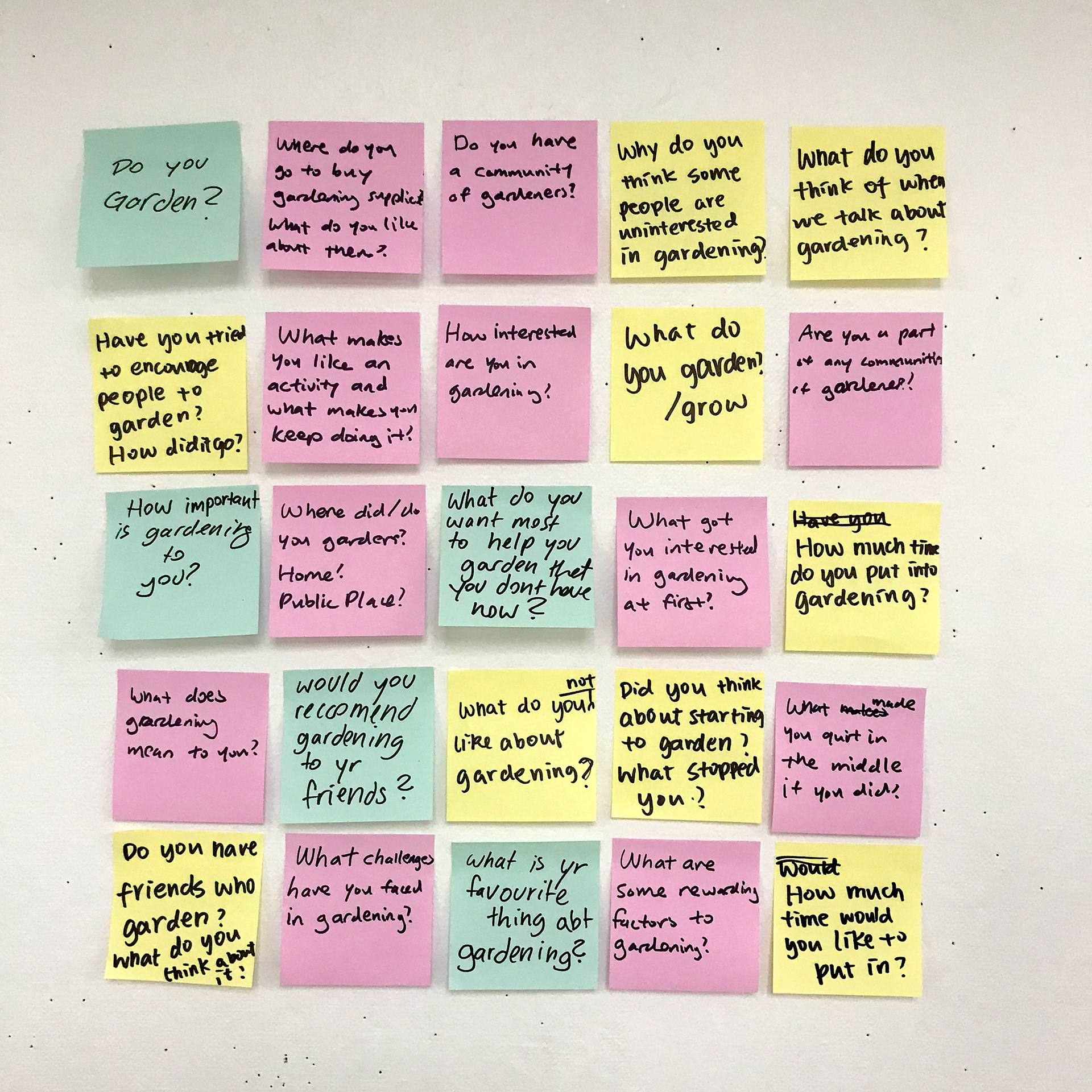
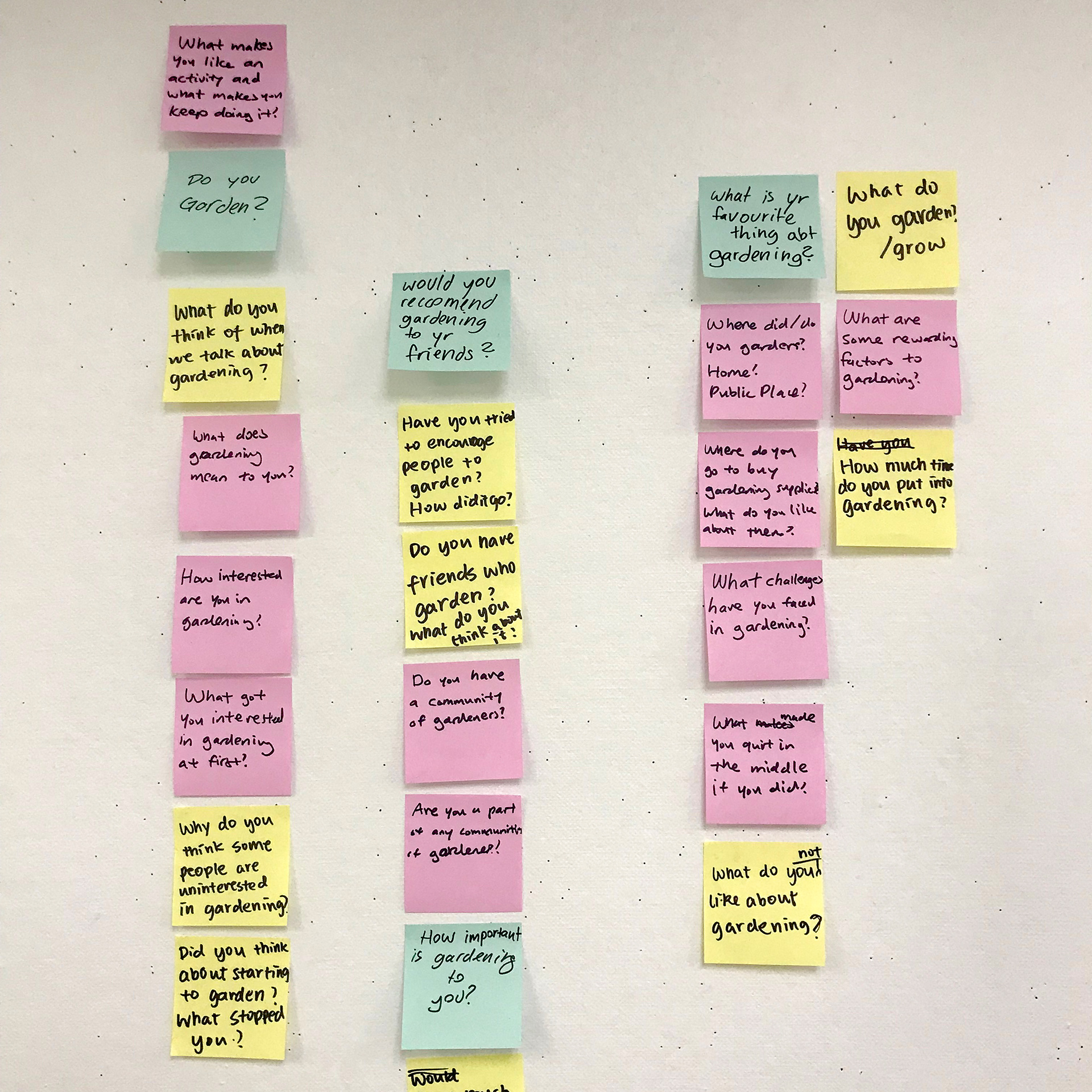
After speaking with ten gardeners of varying experience, we identified the key problem Let's Garden would be tackling: how to maintain new gardeners' excitement about gardening and ensure they continue doing it?
Let's Garden would approach the issue by serving two user groups:
Let's Garden would approach the issue by serving two user groups:
The following are insights we gathered from the aforementioned user groups, which we utilized to determine the key features of Let's Garden.
"I was really excited to start gardening at first, but I got too ambitious. I ended up planting too many things and sort of abandoned them when things got out of hand."
"I realized when I was already in too deep that gardening costs a lot of money. When I first gardened, I spent way much more than I had expected."
"I realized when I was already in too deep that gardening costs a lot of money. When I first gardened, I spent way much more than I had expected."
"I gardened at a public garden sharing community where I engaged with other gardeners, who were mostly more experienced than me. This was really great because I learned a lot from them. It also gave me a reason to not quit as I wanted to share my progress and continue to grow."
"My neighbor just started gardening and I enjoy talking to her and giving her tips. It's always nice to have someone to talk to about something you love."
"My neighbor just started gardening and I enjoy talking to her and giving her tips. It's always nice to have someone to talk to about something you love."
"Different plants need watering at different frequencies. It sometimes gets hard to keep track."
"Depending on the size and shape of the plant, you have to use a certain type of soil and a certain type of pot."
PRODUCT MVP
To support both novice and seasoned gardeners, Let's Garden would provide personalized content on plants depending on user's level of experience and budget, and a platform that connects users to exchange tips on gardening and share one another's struggles and successes.
USER PERSONAS
The following are personas Let's Garden is designed for and created based on our user research.
_________________________________________________________________________
COMPETITIVE ANALYSIS
To obtain a better understanding of our market landscape, we looked at some direct and indirect competitors and analyzed their strengths and weaknesses.
1. LEAFSNAP
Summary: Leafsnap allows users to identify plants in any environment via visual recognition to help them gain a better understanding of plants and leaves. Users can build a collection of plants that interest them and gain academic and historical insights on chosen leaves.
Strengths
Academic index of plants/leaves - not many gardening apps have this. The academic language appeals to users interested in the history and meaning behind the different kinds of plants.
Educational game that strengthens users' knowledge of different types of plants.
Weaknesses
Not the most practical app for users who want to garden.
Although app is pretty straightforward, the app does not have onboarding screens help users navigate through different features.
Interface feels dated. Some images and graphics are low resolution.
2. GARDENIA
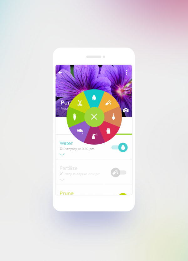
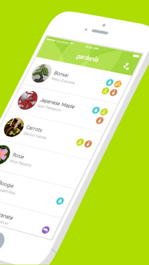
Summary: Gardenia helps users manage their garden by providing features to set tasks and reminders to take care of their garden. Users can also browse an extensive database of
plants and get tips on the specific type of plant such as watering, soiling, exposure to sun, etc.
Strengths
Cute, likable animations for onboarding screens
Gives users practical information that supports their personal gardening
Extensive database of different types of plants with clean and personable interface, strong visual hierarchy of information, and high resolution images and graphics
Supports multiple devices including the Apple Watch to send notifications
Weaknesses
Use various icons as part of their visual language, but their meaning is not clear to first-time users. There are also way too many of them.
Search function not optimized. Users cannot find common plant names and end up having to scroll through hundreds of different types of plants in the database.
Search function not optimized. Users cannot find common plant names and end up having to scroll through hundreds of different types of plants in the database.
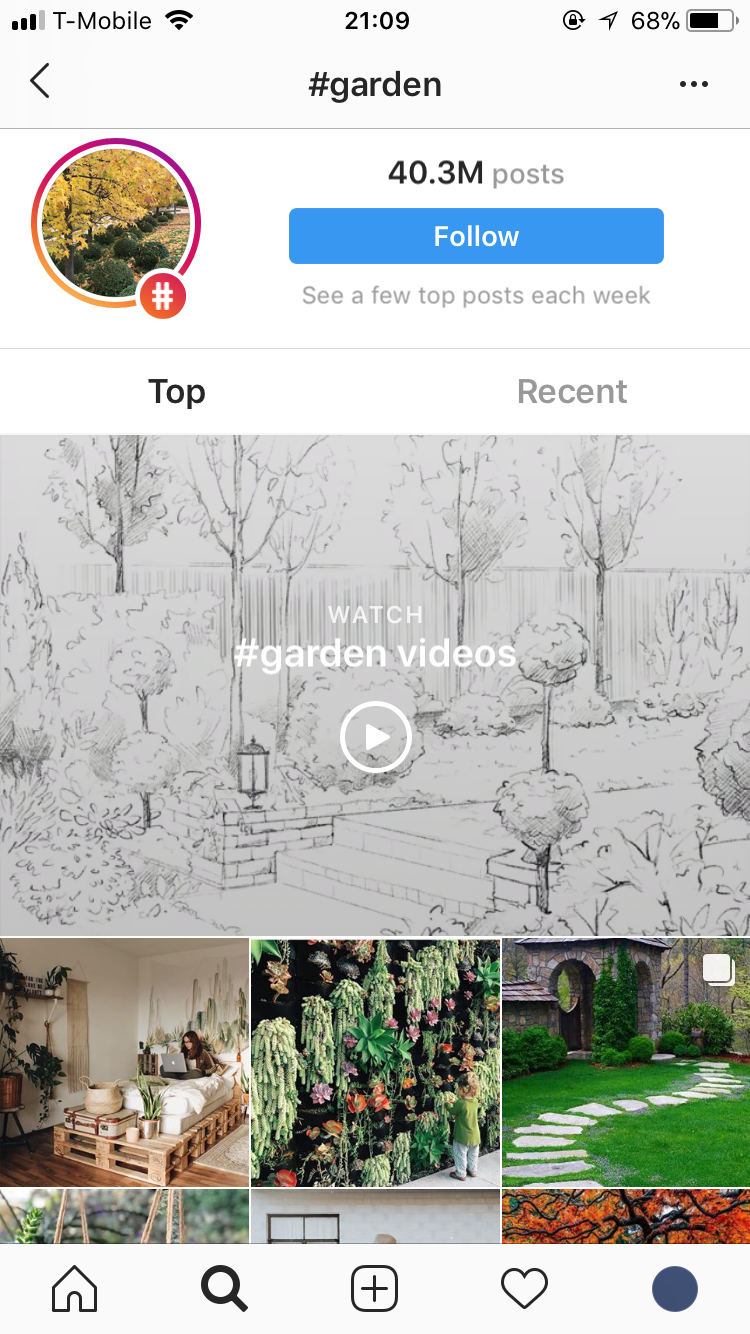
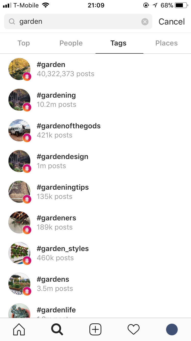
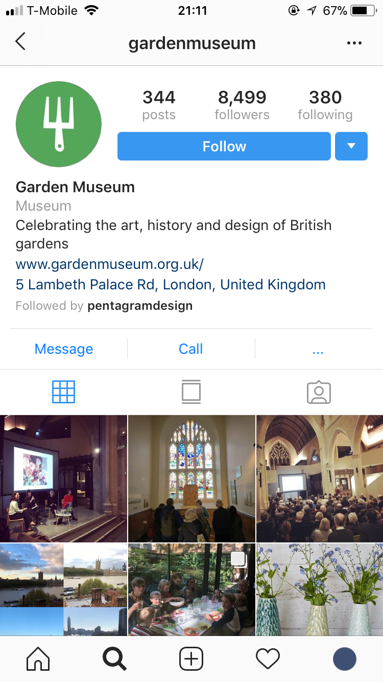
3. INSTAGRAM
Strengths
Wide variety in content serves a wide group of users with different interests.
Wide variety in content serves a wide group of users with different interests.
Fulfills users' need to communicate, connect, and share their various activities and achievements.
Photo filters that enhance users' personal images before sharing to public.
Weaknesses
Mobile experience is Instagram's number one priority. While this is a purposeful choice and is in the company's best interest for their product, it is not to the benefit of users who prefer having services on multiple devices.
Mobile experience is Instagram's number one priority. While this is a purposeful choice and is in the company's best interest for their product, it is not to the benefit of users who prefer having services on multiple devices.
Instagram's wide variety in content and subject matters is both a strength and weakness in that it is not ideal for users looking to join a community with a specific shared interest.
LOW-FIDELITY PROTOTYPE TESTING
With our product MVP in mind, we started sketching our user flow, which included three distinct sets of experiences:
1. Onboarding screens to familiarize user with app
2. Pages to set up profile and provide information to access the most accurately personalized content
3. Main product with features for receiving support in gardening and connecting with other gardeners
Taking this user flow, we created a low-fidelity prototype and tested it on potential users.
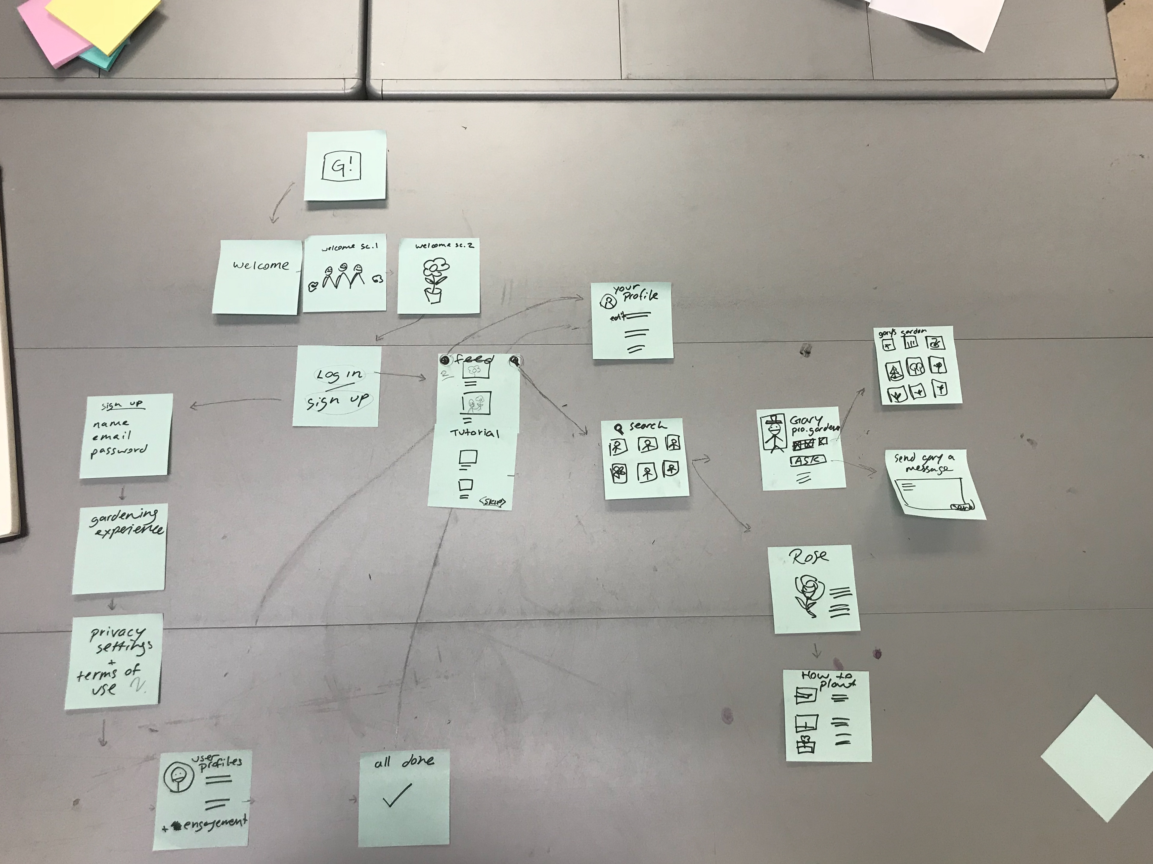
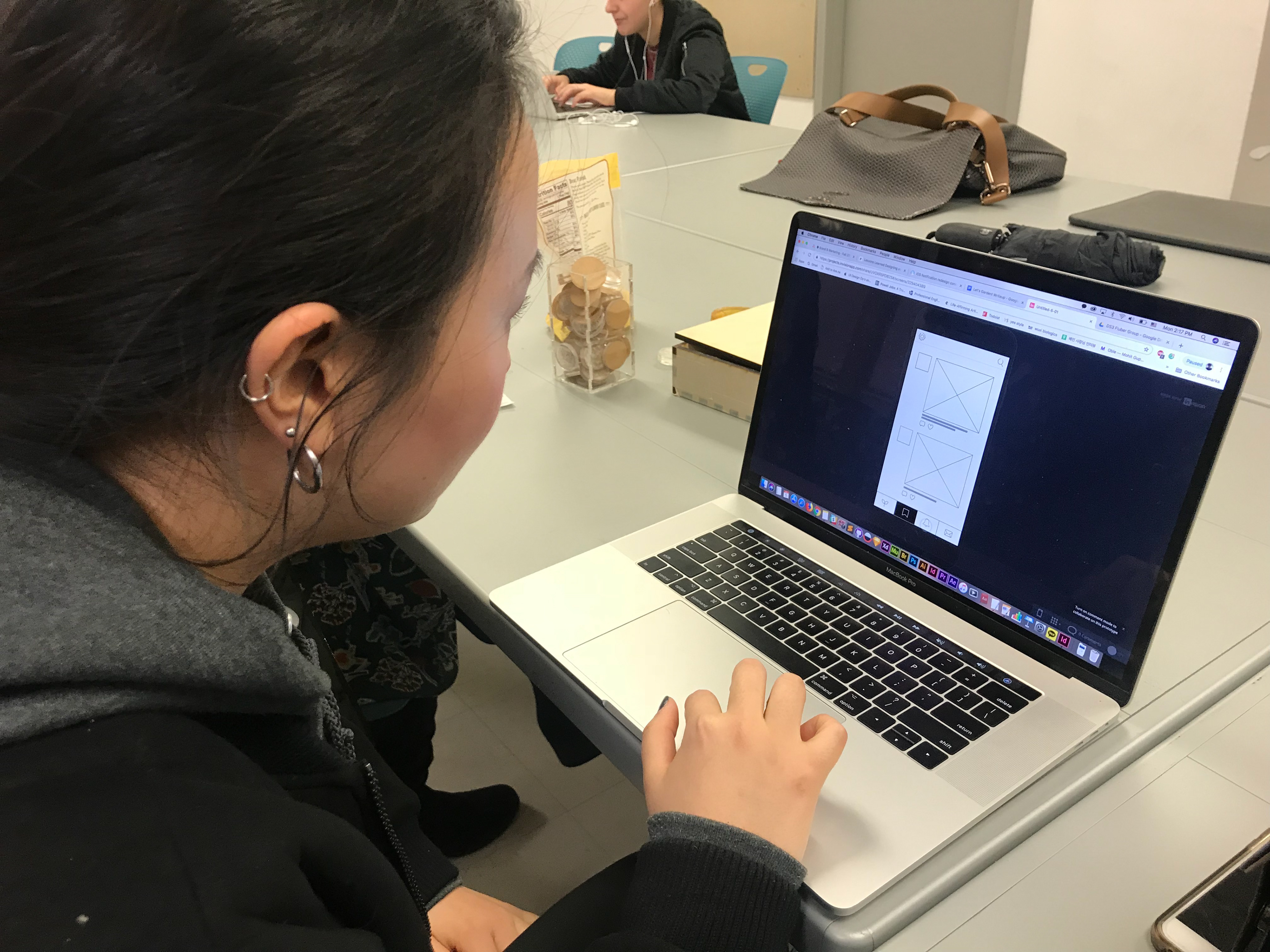
The following are some of the issues users articulated and ways we addressed them.
Users found the meaning of the icons confusing. The icons were not as self-explanatory as we had assumed and to address this we added guiding text below.
The order of the icons threw users off as it was different from what they were used to seeing in Facebook and Instagram. We resolved this by changing the order to align with that of the aforementioned platforms.
Users wanted to see a wider range of images of plants in plant profile. As a result, we added the option for users to select tags when uploading plant images, which would then appear under the relevant plant profile.
Some users felt uncomfortable revealing their age. At the same time, we the creators wanted this information as it would give us a better sense of our user demographic and enable us to update and improve the product in the future. To address this, we had users enter their date of birth, but have the option to hide this in their public profile.
FINAL USER FLOW
Below is the final user flow for Let's Garden.
FINAL PROTOTYPE HIGHLIGHTS
Onboarding screens to give users a better sense of Let's Garden and its features
Personalized content based on user's level of experience and budget
Post and chat features for users to interact and communicate with each other
REFLECTION
Looking back on this project retrospectively, I see some errors and room for improvement.
1. There could have been more brainstorming around how to connect gardeners. I feel that our team committed too quickly on creating a social networking service, and this led to a lot of missed opportunities around how to engage users in conversations.
In addition, we added too many features that are already offered by other more widely used platforms. While it's possible that users could meet on Let's Garden and form deeper connections, their main goal is to share and receive tips on gardening. Instead of features like one-on-one messaging and adding posts on newsfeed, perhaps the app could provide a way for users to document progress and growth of their plants, and other users could leave comments to provide tips/advice/thoughts. To share posts to a broader audience, Let's Garden can be integrated with existing social media platforms like Facebook and Instagram.
2. We should've conducted usability testing on the same people we interviewed for research. Because of time constraints, we conducted usability testing on our classmates, none of whom gardened or we have interviewed prior to testing. Conducting testing on a focus group of targeted users would have given us deeper insights on how gardeners would interact with the product.
3. We should've invested more time on strategizing and create more paper prototypes. We really did jump too quickly into high-fidelity wireframing. We should have brainstormed more ideas on features that would serve users' need and incentivize them to document their plants' growth and connect with other users. If we had presented a wider range of low-fidelity prototypes to our users in testing, they would have been more likely to give honest feedback.
Overall, we started off strong looking into gardening, the tools and labor that go into it, and conducting multiple interviews with gardeners. We did a good job at analyzing competitors' strengths and weaknesses which gave us much guidance and inspiration for our product. It was in prototyping where we could've invested more time in. Once we identified the problem our product was tackling, we committed too quickly to our first idea, a combination of social media and garden management support, without exploring other solutions. The result was a one size fits all product that did not thoroughly investigate ways to encourage connection among users, and the depth of the connection users would be inclined to. While I now see much room for improvement for Let's Garden, my teammates and I took it as a good learning opportunity and came out of it with a major takeaway: never commit to your first idea. Ideate multiple strategies, create multiple low-fidelity prototypes before moving onto digital.