From June 2020 to March 2022, I was a part of the Digital Experience Team at UT Southwestern Medical Center as a UX/UI Strategist. Together with my team, we managed and created the User Experience and Interface of the medical center's academic site.
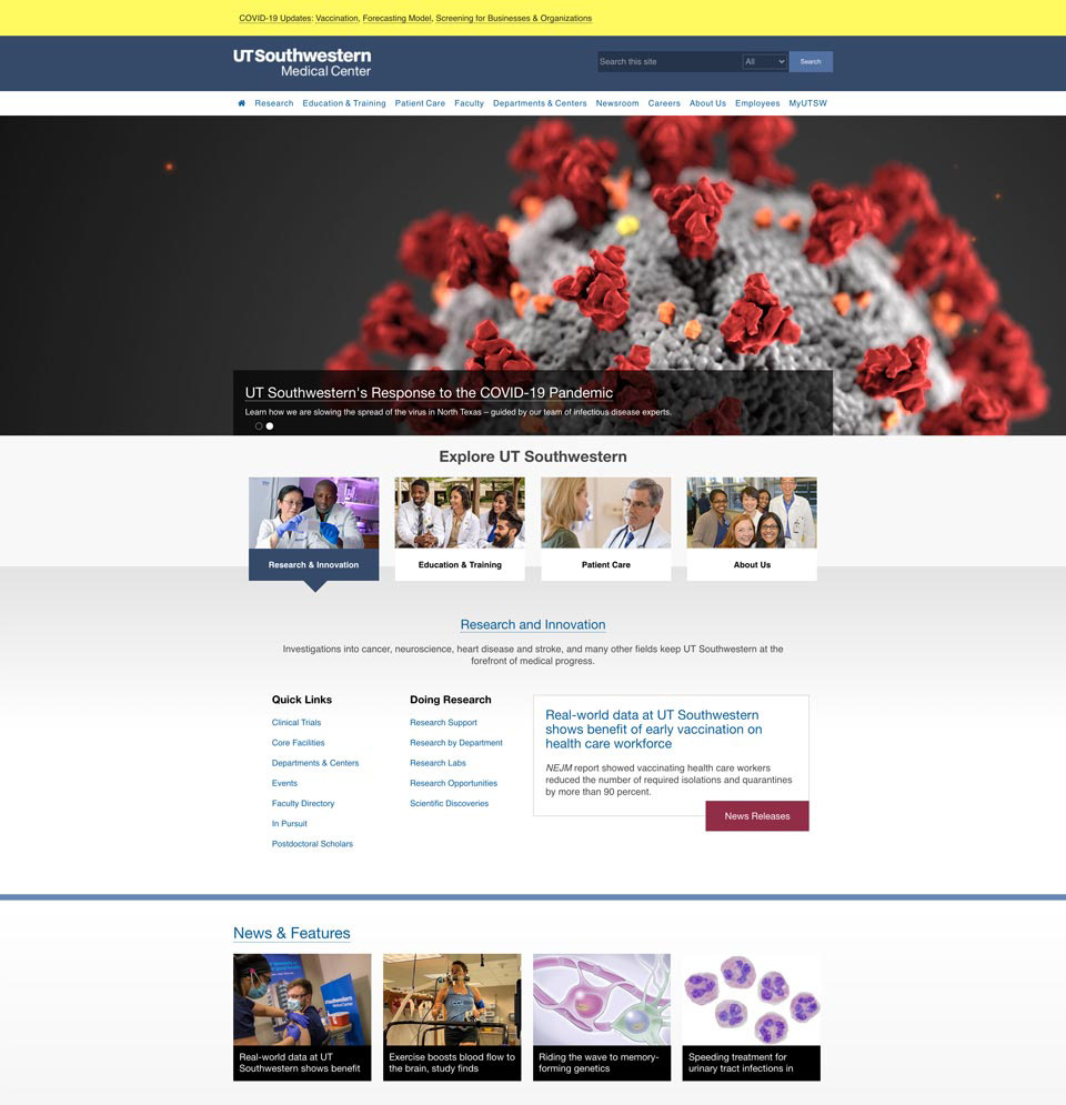
Homepage
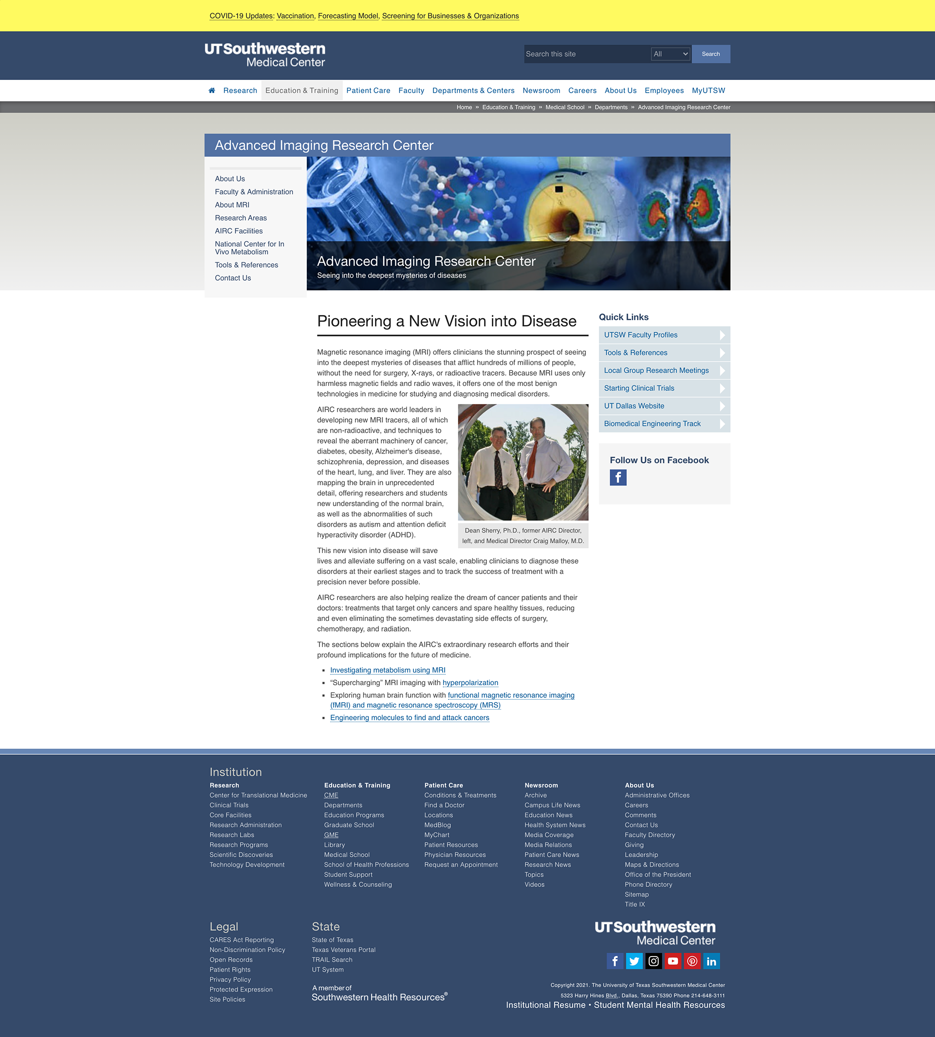
Department Page
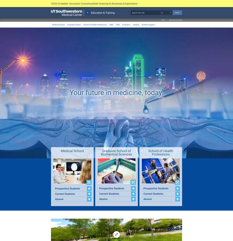
Education Main Page
Although the site had an abundance of rich and exciting content and the passion and dedication of our institute's people was evident, I noticed that it was suboptimal in usability due to the dated aesthetic/typography, poor information architecture, and lack of visual consistency.
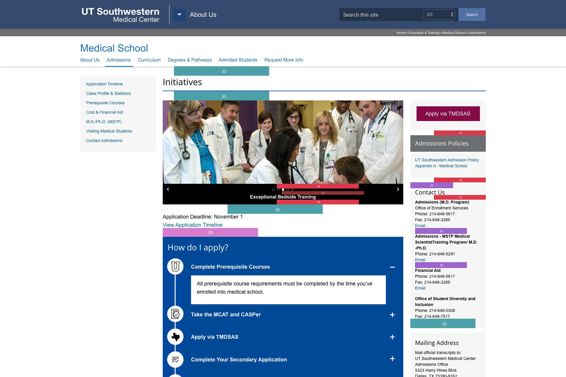
Desktop
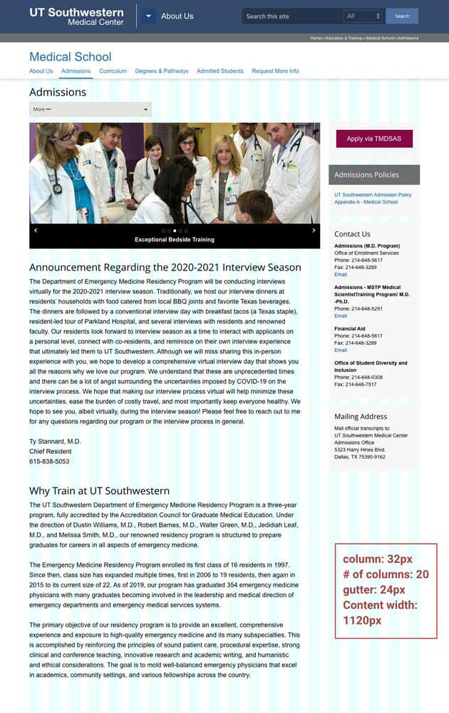
Tablet
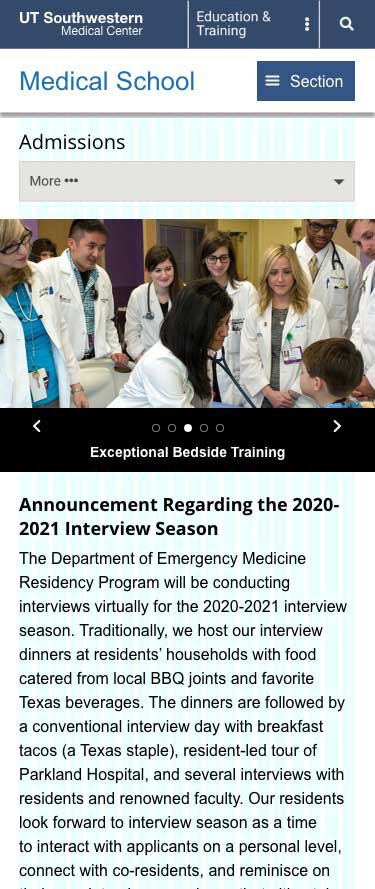
Mobile
To rectify this, I proposed a new design system for the site that introduced a more modern aesthetic, bigger typography and layout, and standardized spacing and information architecture for improved usability. Once approved by upper management, I worked with my manager, Mary Lee - director of Digital Experience team, and our developers to build the framework with my new design system to be implemented for upcoming projects.
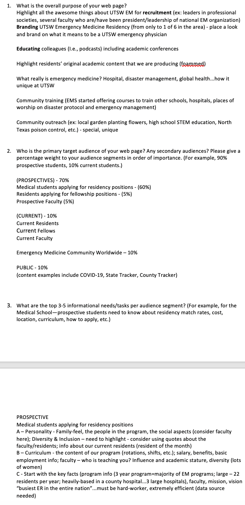
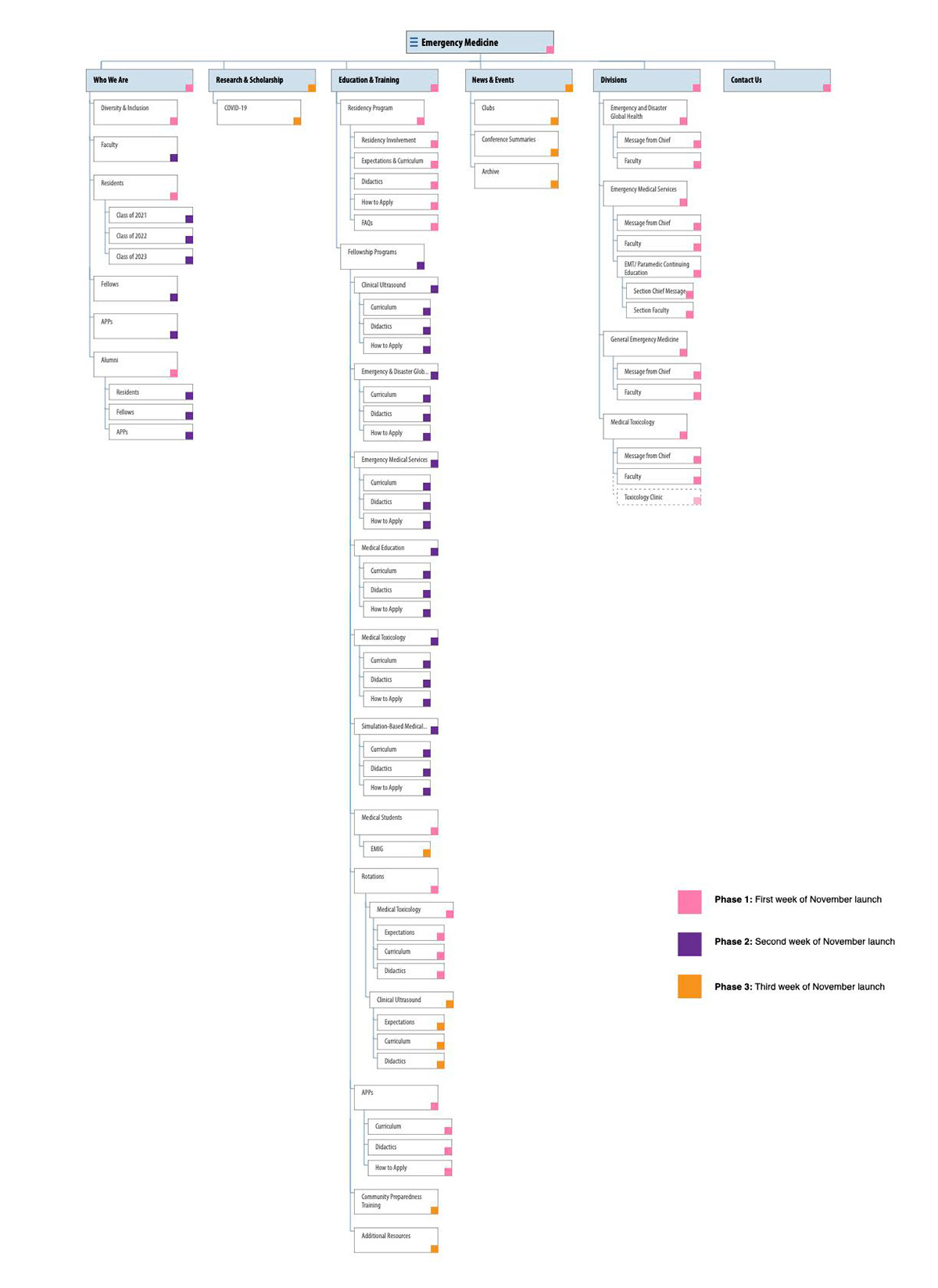
In our product strategy, we decided to launch the Emergency Medicine department upgrade with the new design system. In the process, we met with the department to understand their needs and goals for upgrading their site. With this data, I created a new sitemap and user flow that would shape content structure/ information consumption to meet client goals and improve user experience at the same time.
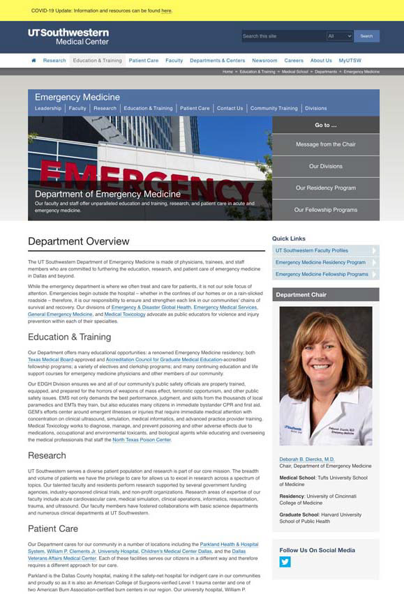
Before Upgrade
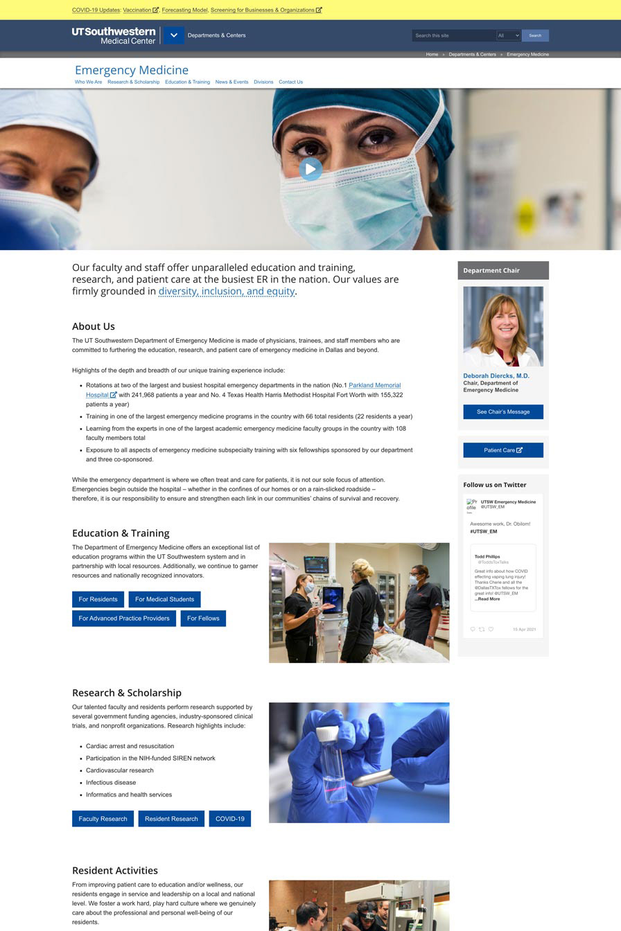
After Upgrade
The upgraded department Emergency medicine site introduced shorter copy with improved imagery and information hierarchy as well as easier navigation as can be seen in landing page that takes users to specific content catered to different user types such as "Residents" or "Medical Students."
The full department site can be found here.
The full department site can be found here.
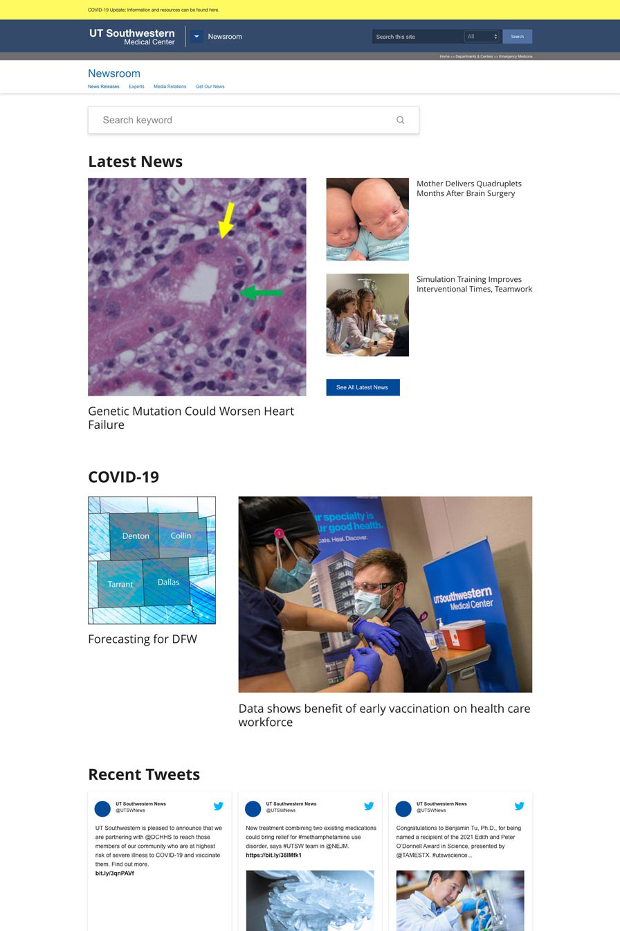
UTSW Newsroom
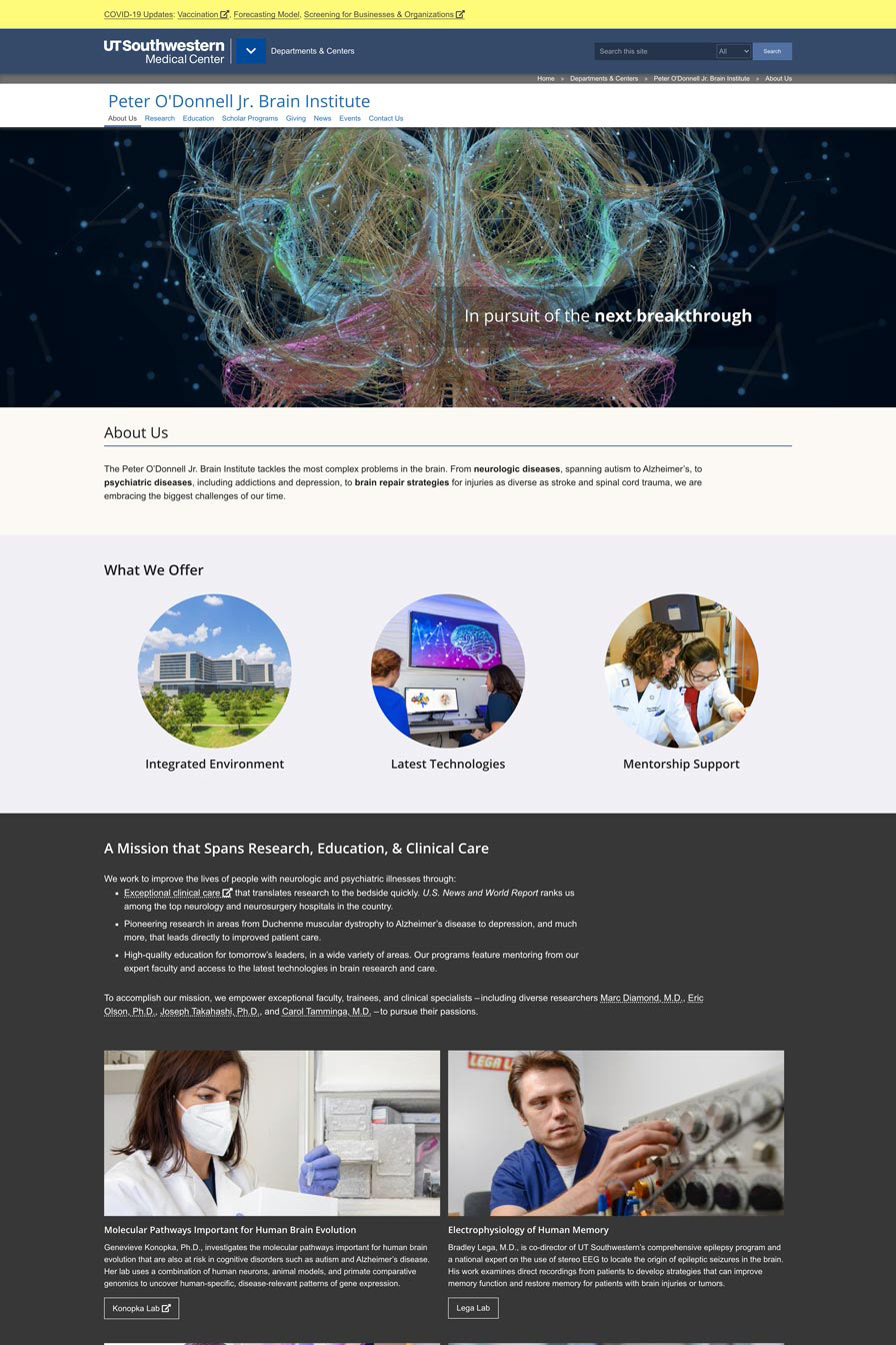
Peter O'Donnell Brain Institute

UTSW Benefits
Since the successful launch of our institute's Emergency Medicine department site, our new design system has been applied to the following projects in our pipeline: Newsroom (currently in-the-works), Peter O'Donnell Jr. Brain Institute, and UT Southwestern Medical Center's Employee Benefits Information site.
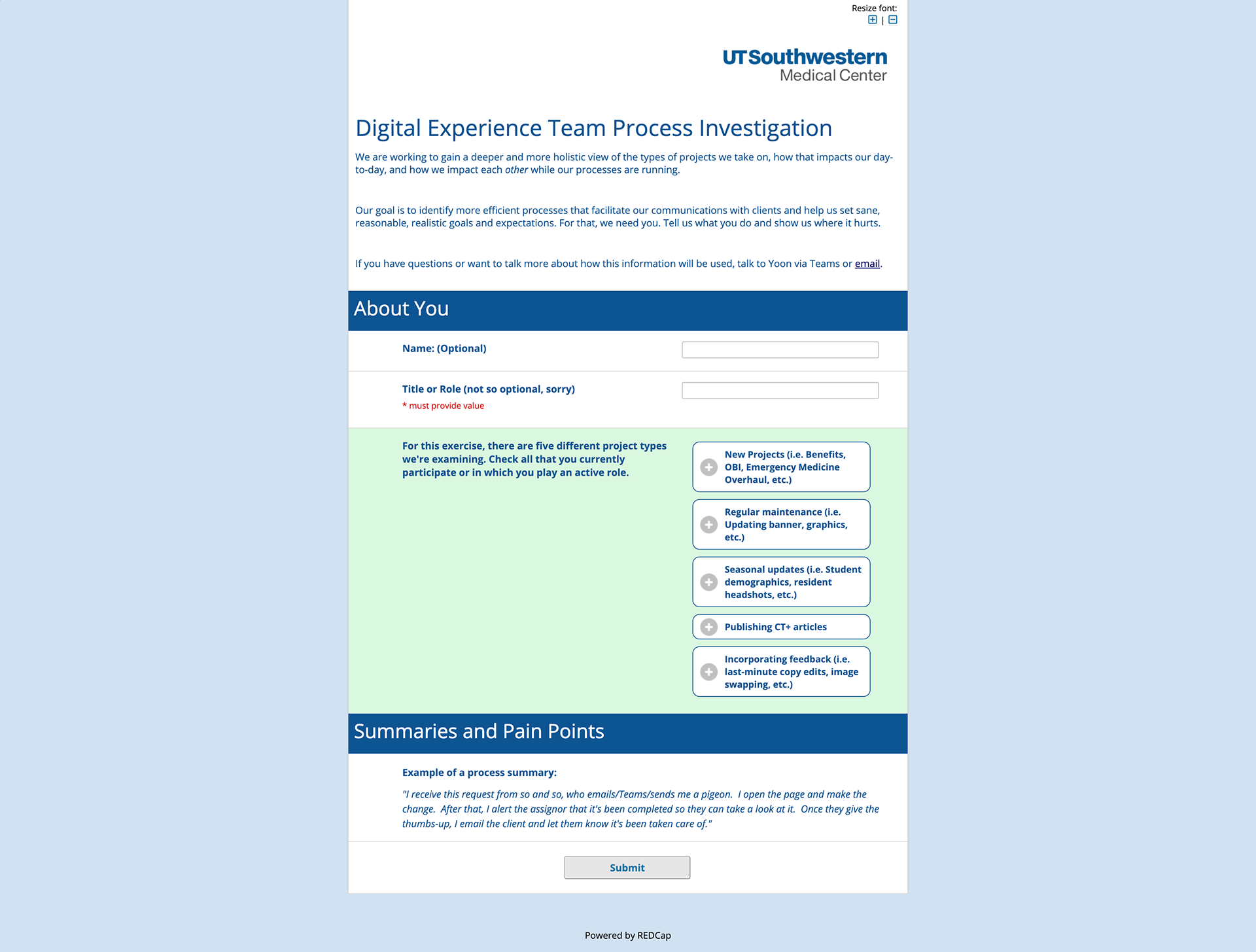
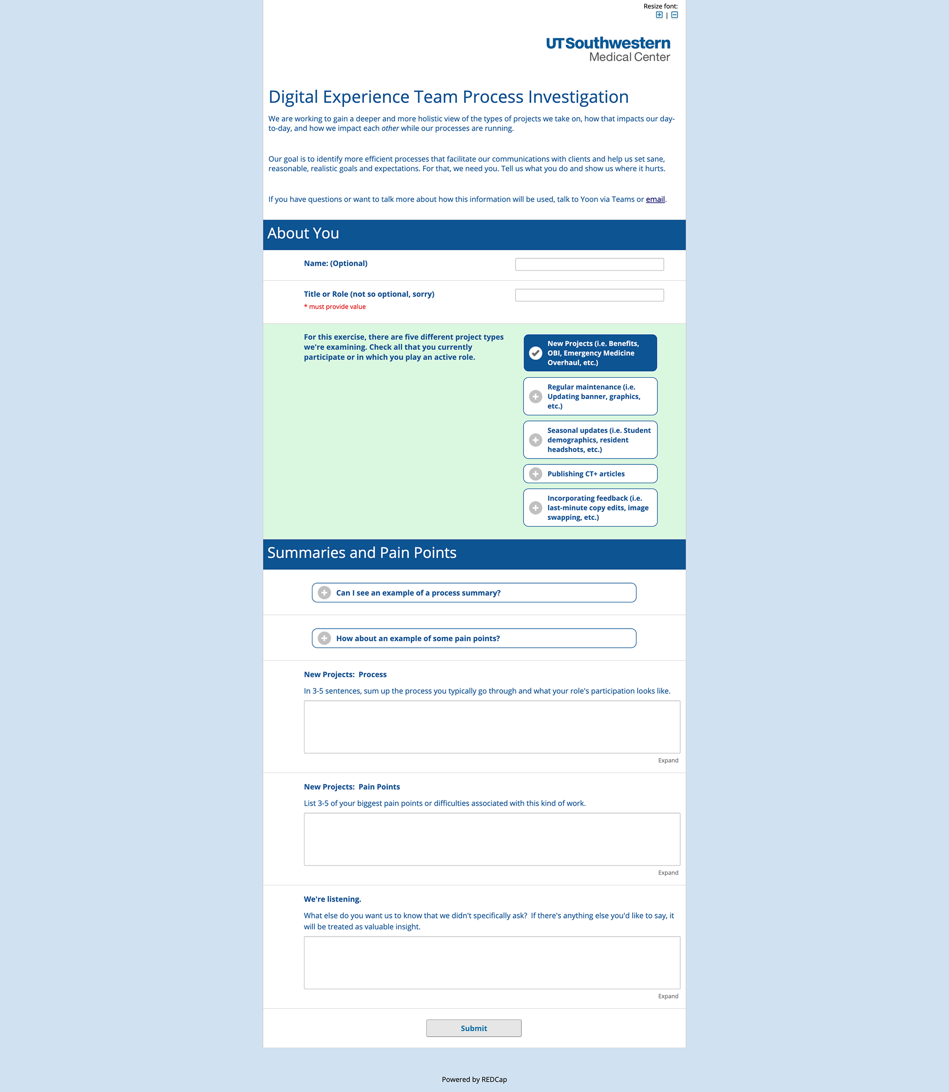
With the ambitious aim of upgrading our pages to the new design system came the challenge of extended work hours that thus prompted our team to improve our day-to-day work process. To tackle this, I started conducting a survey and having one-on-one interviews with our team members to investigate our current day-to-day, various ways we take in new projects from clients, and our overall process in going about multiple projects at the same time.
The aim was to create journey maps and apply UX methodologies to ideate solutions that improve our team's overall work process and help us make realistic deadlines and promises to our clients.